

What is Mobile First?
Definition:
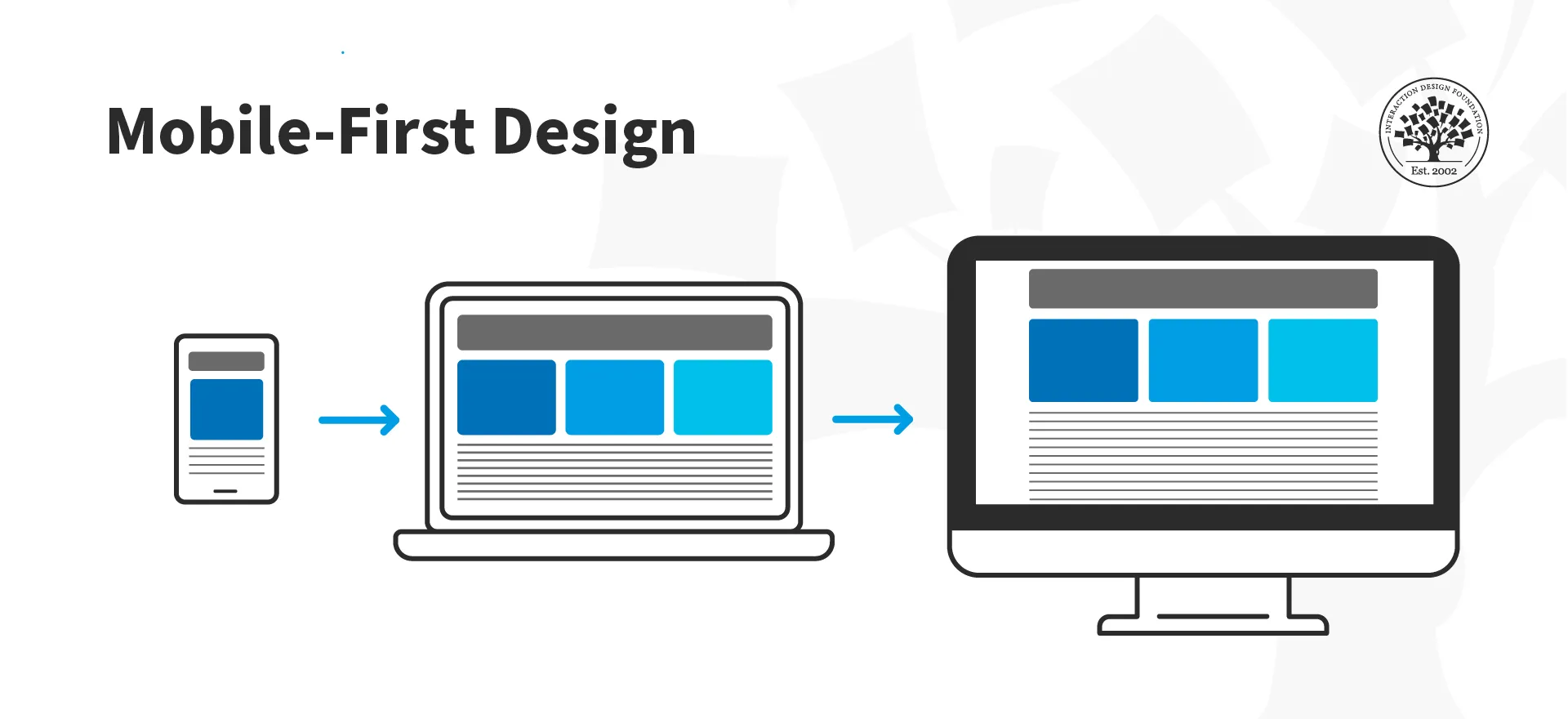
A “Mobile-First Strategy” is an approach to digital design and development that prioritizes the creation of content and user experiences specifically tailored for mobile devices before considering other platforms. In a mobile-first approach, the design and functionality of a website or application are optimized for mobile screens first and then progressively enhanced for larger screens, such as tablets or desktops.
Analogy:
Consider a mobile-first strategy like designing a compact, efficient car for city commuting. The vehicle is initially optimized for the challenges and constraints of city driving (representing mobile users). Once the design is successful for the city, it can be expanded and adapted for highway driving (representing larger screens).
Further Description:
A mobile-first strategy involves several key principles:
Prioritizing Mobile Users: Recognizing that a significant portion of internet users accesses content through mobile devices, a mobile-first strategy prioritizes creating a seamless and optimized experience for this audience.
Responsive Design: Utilizing responsive web design techniques to ensure that content adapts and displays appropriately on a variety of screen sizes, from small smartphone screens to larger desktop monitors.
Performance Optimization: Focusing on optimizing performance for mobile users by reducing page load times, minimizing unnecessary elements, and ensuring smooth navigation on smaller screens.
Touch-Friendly Design: Designing user interfaces that are intuitive and easy to navigate using touch gestures, considering the constraints and capabilities of mobile devices.
Progressive Enhancement: Building upon the mobile-optimized version to add more features and complexity for larger screens, ensuring a consistent user experience across devices.
Why is Mobile-First Strategy Important?
Mobile User Dominance: With the increasing use of smartphones, a significant portion of internet traffic comes from mobile devices. Prioritizing mobile users ensures accessibility and relevance.
Improved SEO: Search engines like Google favor mobile-friendly websites. Adopting a mobile-first strategy can positively impact search engine rankings and visibility.
Enhanced User Experience: Designing for mobile first means focusing on simplicity and usability, leading to an improved overall user experience for all users, regardless of the device they use.
Adaptation to Trends: Mobile-first aligns with current user behavior and technological trends, staying ahead of the curve in a digital landscape that is constantly evolving.
Examples and Usage:
Instagram: Instagram is designed with a mobile-first approach. The app’s user interface is optimized for small screens, and features like photo uploads and stories are tailored for mobile users.
Google’s Mobile-First Indexing: Google has shifted to mobile-first indexing, meaning it primarily uses the mobile version of a site’s content for indexing and ranking. This emphasizes the importance of mobile-friendly design for search engine optimization.
Twitter: Twitter’s platform is built with a mobile-first mindset, allowing users to seamlessly engage with tweets, notifications, and direct messages on various mobile devices.
Key Takeaways:
- Prioritize the needs and experiences of mobile users in the design and development process.
- Implement responsive design techniques to ensure content adapts to various screen sizes and resolutions.
- Focus on performance optimization for mobile devices to enhance loading times and overall user satisfaction.
- Embrace a mobile-first strategy to align with current user behavior and technological trends in the digital landscape.
Table of Contents

