

What is Responsive Design
Definition:
Responsive design is an approach to web design and development aimed at creating websites and applications that provide optimal viewing and interaction experiences across a wide range of devices and screen sizes. It focuses on adapting the layout, content, and functionality of digital interfaces to ensure usability and accessibility, regardless of the device or platform used by the end user.
Analogies:
Think of responsive design as a versatile performer on a dynamic stage. Just as a skilled actor adjusts their performance to resonate with audiences in different theaters, responsive design adapts digital content and user interfaces to engage users seamlessly on smartphones, tablets, laptops, and desktop computers.
Key Components of Responsive Design:
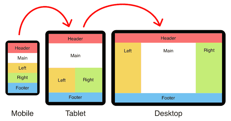
- Fluid Grids: Responsive design utilizes fluid grids that scale proportionally to accommodate different screen sizes and resolutions, ensuring that content remains visually appealing and readable across devices.
- Flexible Images and Media: By employing flexible images and media queries, responsive design allows images, videos, and multimedia content to resize and adapt to the available screen space, preventing distortion and maintaining visual integrity.
- Media Queries: Media queries enable designers and developers to apply CSS styles based on specific device characteristics such as screen width, orientation, and pixel density, allowing for targeted adjustments and optimizations across different viewing contexts.
- Viewport Meta Tag: The viewport meta tag allows developers to control the viewport’s behavior and scale on mobile devices, ensuring that web pages are displayed correctly and users can navigate and interact with content intuitively.
Why Responsive Design Matters:
- Enhanced User Experience: Responsive design ensures a consistent and seamless user experience across devices, eliminating the need for users to pinch, zoom, or scroll horizontally to access content, thus reducing frustration and improving engagement.
- Improved Accessibility: By catering to diverse user preferences and device capabilities, responsive design promotes inclusivity and accessibility, allowing users with disabilities or limitations to access digital content effectively using assistive technologies and devices.
- SEO Benefits: Responsive design contributes to better search engine visibility and ranking, as search engines prioritize mobile-friendly websites in search results, leading to increased organic traffic and better user engagement metrics.
- Cost-Efficiency and Maintenance: Adopting responsive design principles reduces development time and costs by eliminating the need to create separate websites or applications for different devices, platforms, and screen sizes. It also streamlines content management and updates, as changes can be implemented universally across all devices.
Key Takeaways:
- Responsive design is essential for creating modern, user-centric digital experiences that adapt seamlessly to the diverse needs and preferences of users across various devices and screen sizes.
- By prioritizing responsive design principles, organizations can enhance user satisfaction, drive engagement, and achieve business objectives by delivering consistent, accessible, and visually compelling digital experiences that resonate with audiences in today’s mobile-first world.
- As the digital landscape continues to evolve, responsive design will remain a cornerstone of effective web development and user experience design, empowering organizations to stay agile, relevant, and competitive in an increasingly interconnected and mobile-centric environment.
Table of Contents

